Since the release of the Nikon D80, a lot has changed in the DSLR market. Entry level cameras like the D40 and D60 have made DSLRs much more accessible and opened up a lot of creative opportunities for amateur photographers all around the world. The D80 was an excellent camera but got a little lost in the Nikon lineup because it offered too many features for most beginning users and not quite enough for some advanced users. As the high and low-end models started to surpass the D80 in features, many began to wonder when we would see its replacement. The D90 started hitting retailers this past week, and I had the opportunity to get some time with the camera.

Editors Note: This is by no means an exhaustive review but merely my observations on the new camera. At this time, I don’t have any plans to do an in-depth review.

Body

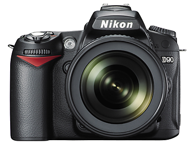
When you first look at the D90, it seems as if almost nothing was changed from the D80. Although the physical body shape is about the same, there have been some subtle but very nice tweaks to the ergonomics. The camera seems a little more comfortable than the D80 (which handled very well), probably due to the slight adjustment of the grip and rear side of the camera. Weight wise, the D90 is virtually identical to the D80.

D90 Front

Front of the D90

The viewfinder is just about the same as the D80 including the same 11-point AF system and on-demand grid lines. One thing that was kind of interesting is you can now choose to have the number of remaining shots or the current ISO value displayed in the viewfinder. It would have been nice to have both, but beggars can’t be choosers.

Current D80 users will be happy to know their MB-D80 battery grip is fully compatible with the D90. I didn’t have the chance to try it out, but I’d suspect it feels the same way it did on the D80.

Control Layout

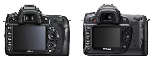
Current Nikon users will feel right at home because the control layout on the D90 is about 99% the same as the D80. The only major changes is the OK button is now an INFO button, a redesign of the lock switch and multi-selector, and the addition of a Live View button. The new lock switch is not as easy to bump as on the D80 and the multi-selector is a huge improvement and very similar to that of the D700/D3.

D90 Controls vs D80 Controls

D90 Controls vs D80 Controls

Similar to all the recent Nikons, the INFO button can be used to bring up all of your current settings on the D90’s new big, bright 3.0-inch LCD screen. You can also tap the INFO button twice to access key Picture Controls and button customization without having to dig through the menu. I love this feature on the new D700, and I’m glad to see Nikon implementing it in all of the new cameras. For traditionalists, the top LCD displays all of the same information as the D80.

Menus

The menus in the D90 have been largely refined from the D80. The custom setting menu is now laid out like the higher models, splitting the menu into six different color-coded sub-menus (Autofocus, Metering/Exposure, Timers/AE Lock, etc). This is going to be a huge time-saver, especially considering there are over 40 custom settings.

The Shooting Menu is very similar to the D3/700/300 with the addition of the new Picture Control system, Active D-Lighting, and noise reduction options.

The D90 also features the Retouch Menu, inherited from the D40 and D60. There are some pretty interesting effects here, but I just can’t see most people spending time editing their pictures on the back of the camera screen. One interesting feature I stumbled on by accident, however, is the face detection in image playback. When you zoom into a picture on image playback, you can use the front command dial to center the zoomed image on a person’s face. Best of all, when you have multiple faces in the picture, it will scroll from face to face. I’m sure this will probably get overlooked by a lot of people, but I can think of many situations where this would be handy.

Performance

The D90 seems to be the “little brother” to the D300, similar to how the D80 was to the D200. While there are certainly some sacrifices in terms of build, durability, and features, the D90’s image quality seems to be almost identical to that of the D300. Considering both cameras use the same sensor, this should be no surprise. The autofocus does an excellent job as well, and seems to be a slight improvement over the D80.

Video Recording

One of the most talked about features when the D90 was announced was the video recording capabilities. While I didn’t play with this feature extensively, the quality was outstanding.

The biggest limitation I found was that you are strictly limited to manual focus. Focusing was absolutely no problem in controlled situations but I found it a bit hard to handhold, especially in sunlight. Because you have to use the camera in live-view to make use of the video, you can’t really steady the camera the way you’d normally hold an SLR, making it a bit shaky.

Even though the LCD is much better than that of the D80, it’s still very hard to see in bright sunlight – which makes critical focusing a bit difficult if you have to handhold the camera. If you plan to make use of the video extensively, I would definitely recommend bringing along your tripod.

Images

Here are a few images from my time with the D90. These are all JPEGs, with various different Picture Control settings (some custom). Like I’d mentioned earlier, the image quality seems to be nearly identical to the D300.


Nikon D90

Nikon D90, 18-105mm f/3.5-5.6 VR, 1/800 sec @ f/8, ISO 200

Nikon D90

Nikon D90, 18-105mm f/3.5-5.6 VR, 1/500 sec @ f/5.6, ISO 100 (Lo 1)

Nikon D90

Nikon D90, 18-105mm f/3.5-5.6 VR, 1/160 sec @ f/5.6, ISO 100 (Lo 1)

Nikon D90

Nikon D90, 12-24mm f/4, 1/250 sec @ f/5.6, ISO 200

Nikon D90

Nikon D90, 12-24mm f/4, 1/500 sec @ f/8, ISO 200

Nikon D90

Nikon D90, 50mm f/1.8, 1/40 sec @ f/2.2, ISO 1600

Conclusion

I think Nikon has positioned the D90 in an excellent place in their lineup. They’ve put enough features in it to make it a worthwhile step up from the low-end cameras (a problem the D80 faced with the introduction of the D40X and D60) but not as many professional features as the D300. The D90 has already been dubbed by many to be a “poor-man’s D300,” which I think will definitely be the case for a lot of people.

I think it will also serve as a very worthy upgrade for all of the D40/40X/60 owners looking to take the next step in the Nikon lineup. I think D80 owners looking to take the next leap would still be better jumping up to the D300, but the D90 still provides enough upgrades for those users at a much lower cost.

While the video does have its limitations, it’s still a groundbreaking feature that I’m sure many manufacturers will start implementing in their DSLRs (as this article is being published, Canon just announced the EOS 5D Mark II, their first DSLR with video capture capabilities). No matter how you look at it, the D90 is definitely going to be a hot seller with the amount of features it offers for its price.

Last summer when Nikon announced the D3, there was a lot of speculation as to when we would see a smaller, lighter body with a full-frame chip in it. Well, the Nikon D700 is pretty much just that: a slightly modified D300 body with the 12.1MP FX format chip from the D3. I had a chance to get some hands-on time with the D700, and it’s sure to be a hit with the Nikon crowd.

Editors Note: This is by no means an exhaustive review but merely my observations on the new camera. At this time, I don’t have any plans to do an in-depth review.

Body

The first thing you’ll notice if you’re a D300/D200 shooter is the D700 is noticeably heavier (32.6 oz vs 37.9 oz). This was a little surprising at first, but it actually makes the D700 feel a little more solid than the D300 and actually closer to the D3. The D700 also sports a slightly taller pentaprism and what feels like a slightly thicker grip. The CF door is somewhat of a departure from the D300/200 but actually works very nicely. I know a lot of people were concerned about the door being flimsy, but it’s spring loaded and feels pretty solid.

D700 Right

Right Side of the D700, including new CF Door.

Looking through the viewfinder of the D700 is quite a sight. Even though it’s not quite as large as the D3’s 100% coverage, it’s still very large. The Autofocus system is the same 51-point system found in the D300 and D3 but slightly differs from both cameras. The coverage is weighted towards the center like the D3 but features the black AF-point highlighting of the D300.

The D700 also feels great with the MB-D10 attached. Personally I think I’d leave the grip off the camera most of the time since it feels very solid without it. Not to mention the MB-D10 adds more weight and actually makes the D700 bigger and heavier than the D3.

Control Layout

If you’ve handled a D300 or D3, the D700 should be nothing new. The controls are almost identical with a couple exceptions. First, the Info button is no longer shared with the lock/help button and now sits below the AF area mode selector. The D700 also inherits the multi-point selector from the D3, which I find easier to use compared with the D300.

D700 Rear

D700 Back. The controls are largely unchanged from the D300.

The top LCD panel displays quite a bit less information as compared with the D300. Most of what was removed however can be found on the rear LCD by pressing the Info button. The new Info screen is going to be very useful because it gives you quick access to common functions such as your Shooting/Custom Setting banks, and Picture Controls, Active D-Lighting. It also allows you to view or re-program what functions you have set for the DOF Preview, Function, and AE/AF-L buttons. This may seem trivial for some, but I think it’s going to save a lot of time sorting through common camera functions on the fly.

I was also very glad to see the rangefinder MF focus confirmation in the viewfinder. I’ve always missed this from the D200/300, and it’s good to finally see it in a model other than a flagship camera. For those not familiar, the rangefinder focus gives you an arrow to the right and left of the focus confirmation dot to give you an idea of how close you are to being in focus. (It kind of looks like this: >o<).

Menus

The menus of the D700 are very similar to its big brother and little brother cameras. The D700 has all of the functions from the D300 plus a few from the D3 including vignette control, FX/DX format selection (sadly the 5:4 crop mode is not available), and virtual horizon.

Performance

The D700 performs very well. The AF performance seems identical to the D200/D300 and it has the same great high ISO performance of the D3. The high ISO performance is certainly going to be the big selling point for most people and the D700 definitely delivers in that category. The shots I took at 3200 ISO still retained a lot of detail and looked very clean. The slight drop in frame-rate might be a disappointment for some, but the MB-D10/EN-EL4a/8-AA battery combo can easily solve this problem if it’s an issue. For me, I’d much rather have the full frame over the faster fps.

SB-900

I also had a chance to play with the new SB-900. I think the new interface is worth the extra price alone! The navigation is much easier, especially when accessing CLS functions. The click wheel is much easier to navigate through functions compared to the cross pad on the SB-800. It’s also easier for things like the zoom and exposure compensation because all you have to do is click the function you want to change and rotate the wheel.

SB-900 Speedlight

The new SB-900 Interface.

The recycle time of the SB-900 with 4 batteries is definitely on par with the SB-800 and 5 batteries. The flash had no problem keeping up with a burst from the D700 of about 8-10 images on cheap alkaline batteries. Power seemed about the same between the two flashes, but the new added flexibility is a very welcome change. There are also a couple of new “illumination modes”: standard, center, and even. I didn’t play with these extensively, but between these new modes and the extended zoom range, the SB-900 is sure to open up a lot of creative possibilities.

Images

These are a couple of shots I took with the D700. I was just trying to get a feel for some of the features of the camera and it certainly delivers. These are JPEGs taken straight from the camera with Standard Picture Control, with the default sharpening bumped up slightly. They’ve been resized from Lightroom for the web.

Nikon D700

Nikon D700, 70-300mm f/3.5-5.6 VR, 1/800 sec @ f/8, ISO 400

Nikon D700

Nikon D700, 24-70mm f/2.8, 1/125 sec @ f/8, ISO 6400

Nikon D700

Nikon D700, 24-70mm f/2.8, 1/125 sec @ f/8, ISO 6400

Nikon D700

Nikon D700, 24-70mm f/2.8, 1/1000 sec @ f/2.8, ISO 6400

Conclusion

I intentionally held off upgrading my D200 to a D300 simply because I had a feeling a camera like the D700 was coming down the road. The D300 is an excellent camera but I’d rather have the benefit of a full-frame sensor. Even though I don’t utilize it often, the excellent high ISO performance certainly doesn’t hurt either. Does that mean everyone should get a D700 over the D300? Not necessarily. I think there’s definitely a clear distinction between the two cameras and each one has clear benefits depending on the type of shooting you do. For the type of shooting I primarily like to do, I’m sold on the D700.

The Ray Flash is an adapter that slides over the front of your flash and locks down to the top of the flash via a tightening knob. Your flash then shoots into a prism connected to a series of clear tube-looking rings that circle around the lens (the manufacturer calls these “light shapers”).

Installing the Ray Flash

Installing the Ray Flash
Image Courtesy of ExpoImaging.

The light shapers are backed with a highly reflective surface to minimize light loss. The test readings we took indicated a light loss of a little over a stop, which is right around the norm for a lot of hot-shoe flash modifiers.

The opening on the front is pretty large, and we had no problem fitting a lens with a 77mm diameter through the Ray Flash opening. One design problem I encountered was the flash autofocus illuminator is blocked. Keep in mind, this can be very problematic if you plan on working with the Ray Flash in low-light conditions.

Perhaps the biggest advantage to the Ray Flash is the fact that it works full TTL with your flash. The flash did all of its normal TTL calculations and was still able to work as a Nikon CLS commander. This will probably be a huge selling point for most people and makes the Ray Flash very versatile.

Working with People/Animals

The Ray flash does its job of providing a shadowless look on the subject. If you are close to a wall or backdrop, it provides a very interesting shadow wrap that gives the subject an almost three-dimensional look, just like you’d expect out of a ring flash. I think perhaps my favorite part of the Ray Flash is the very interesting catch light it provides in your subject’s eye. The closer you get, the larger the ring looks.

Ray Flash Example

The Ray Flash provides almost shadowless lighting with a very interesting catch light.

For shooting outdoors, it worked excellent as a fill-light. Since the light surrounds the lens, the light wraps around the subject and produces a very nice illumination.

Ray Flash Example

Using the Ray Flash outdoors as a fill flash.

Macro/Close-Up Work

I think one of the other reasons people will plan to purchase the Ray Flash is for macro or close-up photography. Once again the Ray Flash did work in this application and did an excellent job of filling in some of the shadows. Below is a with/without example of the Ray Flash on a macro shot.

Before and After Ray Flash

Nikon D200, 60mm f/2.8D Micro Nikkor, SB-800, f/13 @ 1/250 sec, ISO 100
Roll over for the before/after. Notice how the Ray Flash provides a subtle fill on the shadows but does not completely eliminate them. This makes the shot look much more natural.

I also did a little experiment with some tabletop photography, and it actually worked very well. This may not necessarily work for everything, but it does provide a very three-dimensional look when your subject is directly on a solid background.

Ray Flash Example

The Ray Flash produces a three-dimensional looking shadow wrap when photographing objects close to a background.

Conclusion

The Ray Flash is a very viable solution for people who want a portable ring flash solution to take in the field. It works exactly as advertised and should provide a lot of versatility for wedding, portrait, or macro photographers.

Macro photographers may want to weigh their options since the Ray Flash is priced relatively close to dedicated macro flash systems. For people who work primarily in a studio environment, a dedicated ring flash might be a better alternative (the very popular Alien Bees ABR800 ring flash starts at about $100 more than the Ray Flash and provides quite a bit more power and modification options).

The Ray Flash is compatible with most Canon and Nikon bodies in conjunction with the 580EX/580EX II or the Nikon SB-800 (and presumably the SB-900 down the road) for $299.99.

There are different models for each camera/flash combination, and you can see a compatibility chart here.

Pros

  • Works as advertised. The Ray Flash provides a lightweight, portable solution for photographers who want the look of a ring flash without the bulk of a studio ring flash. It definitely provides the light-wrapped look of a ring flash.
  • TTL is no problem. All of your flash’s normal TTL operation works without a hitch. This makes the Ray Flash extremely easy to adapt to.

Cons

  • Price. The price of $299.99 is very steep for a hot-shoe flash modifier. Even though it does work, the price is approaching your basic studio ring flashes or macro flash solutions.
  • Construction. The lightweight construction is nice for portability but seems a little flimsy during regular use. There does seem to be a lot of play even with the provided wedge to prevent it.